Being a therapist today means more than just providing exceptional care—it also means building a digital presence that reflects your expertise. However, getting your website right can be tricky. You may find yourself wondering, “What should my website include to attract the right clients?” or “How do I create a website that feels inviting without overwhelming potential clients?”
When these questions hold you back, it becomes difficult to make progress on your digital presence.
The good news? Designing a website that supports your practice doesn’t have to be complicated. By following a few key components, you can create a website that resonates with clients and reflects the heart of your work as a therapist.
In this post, I’ll share 3 essential ingredients that make up the perfect website for therapists in Sydney. By the end, you'll have a clear roadmap to build a site that not only attracts the right audience but also establishes trust from the first click.
What is the Perfect Web Design for a Therapist in Sydney?
A perfect website design for a therapist in Sydney provides clear messaging, easy navigation, and helps therapists showcase their expertise. It offers an easy way for clients to book sessions, read about services, and feel connected to the therapist's approach.
In other words:
There are three critical elements to a client-attracting website for therapists in Sydney—strong messaging, intuitive design, and engaging calls to action (CTAs).
The added benefit? A well-designed therapy website will boost your credibility and make it easier for potential clients to book with you.
1 – Clear and Compelling Messaging for Sydney Therapists
Your therapy website homepage should have a clear tagline that instantly communicates who you help and how. For example, your tagline might read: “Helping individuals overcome anxiety and find peace through counselllng.”
This is essential because therapists who clearly define their services and niche attract more of the right clients. However, many therapists struggle with knowing how to phrase their message, which can lead to visitors feeling unsure and leaving the site.
The key to a compelling homepage message is being specific about what you offer. Start by writing out who your ideal clients are and the services you provide. A simple first step is to brainstorm taglines like “Couples therapy for deeper relationships” or “Managing stress through mindfulness coaching.”
2 – Simple and Easy-to-navigate Design for Sydney Practices
A clean and intuitive website design for therapists in Sydney ensures clients can easily find what they need. Your site should have a simple navigation menu with essential links to your About, Services, and Contact pages.
If your website feels cluttered or confusing, potential clients may get frustrated and leave before booking a session. Having an organized, mobile-friendly therapist website in Sydney gives visitors the confidence to explore your services and contact you.
What can you do?
To simplify your design, try organising your site with 4-5 key pages and ensuring the navigation is easy to access on both desktop and mobile. You can also include call-to-action buttons like “Book a Free Consultation” or “Get in Touch.”
3 – Client-Focused Call-to-Actions (CTAs) for Sydney Therapists Websites
A call-to-action (CTA) guides your visitors toward their next step, such as booking a consultation or exploring your services.
This is where your website starts working for you. A well-placed CTA directs your visitors to engage with you, whether that’s by booking an appointment, filling out a contact form, or downloading a free resource.
However, many websites either miss these opportunities or make their CTAs too vague (e.g., “Click here”). This creates uncertainty, and potential clients may leave your site without taking action.
Here’s a simple approach to get it right:
The first step: Add a “Book a Free Consultation” button on your homepage.
The second step: Place a CTA on every service page, guiding visitors toward scheduling a session.
The third step: Offer a downloadable resource (e.g., “5 Steps to Managing Anxiety”) to nurture hesitant visitors.
With these CTAs in place, your website will create a seamless journey, guiding visitors to take action and connect with you.
Putting it All Together for Your Perfect Therapist Website in Sydney
There you have it! The 3 essential components of a perfect therapist website in Sydney:
- Clear messaging to connect with your audience.
- A user-friendly design to create a smooth browsing experience.
- Strong call-to-actions to encourage engagement.
While creating a website may feel daunting, taking small steps—like writing a compelling tagline or simplifying your navigation—will make all the difference.
Need help getting started?
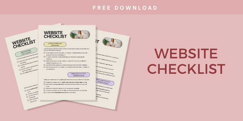
If designing your own website feels overwhelming, my Free Therapist Website Checklist will walk you through the process step-by-step. This free guide ensures you’ll have everything you need to launch a website that attracts your ideal clients and grows your practice.
About the author


